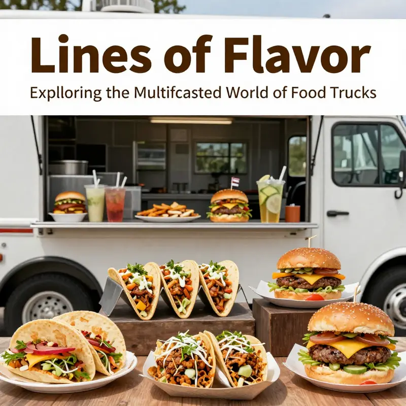
Food trucks have swiftly become a beloved part of street food culture, serving everything from gourmet tacos to artisanal donuts. But beyond their delicious offerings, the concept of ‘line’ plays a pivotal role in understanding the dynamics that make these mobile kitchens thrive. In this article, we will explore ‘line’ in various contexts, including the eye-catching line art and logo designs that shape a truck’s identity, the customer queues that signify popularity, the diverse menu line-ups that cater to varying tastes, and the product lines that reflect the diversity of food truck operations. We’ll also delve into the cultural experiences that emerge when food trucks gather at events, highlighting why they’ve become more than just meal options. Each chapter provides insights into how these aspects contribute to the allure and success of food trucks, making them a worthwhile addition to any event planner’s roster.
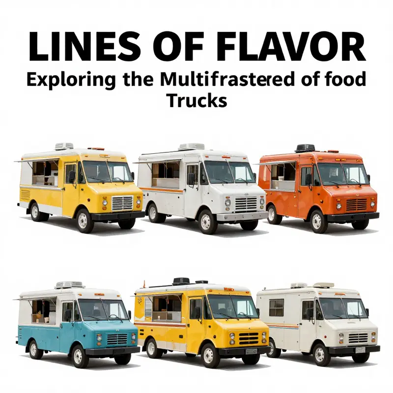
Line Art and the Food Truck Brand: Designing a Minimalist Identity
![]()
The street-level theater of a food truck begins long before a customer steps up to order. It begins with lines—simple, continuous gestures that trace a silhouette, outline a character, or echo a mood even from a distance. Line art, in its cleanest form, communicates speed, personality, and promise with a single, easily readable mark. In the crowded world of mobile eateries, a minimalist line logo acts like a verbal cue you don’t have to speak aloud. A well-crafted line shape becomes a recognizable silhouette that can be identified across a storefront banner, a truck wrap, a social post, or napkins you hand to the customer. The magic lies in restraint. A single continuous line—no extraneous details, just the essential contour—can capture the idea of your food, your vibe, and your efficiency all at once. This is not just an aesthetic preference; it is a strategic decision about visibility in real-world, real-time service.
When designers talk about line art for a food truck, they mean a visual vocabulary built from simplicity. A continuous line can produce a cheerful outline of a smiling chef, a stylized steam curl rising from a hot dish, or a compact wagon shape that embodies mobility and hospitality. The appeal is twofold: the line’s economy makes the mark highly legible at varying distances and scales, and its fluidity allows it to adapt across media. A logo drawn in one unbroken stroke translates smoothly to a vehicle wrap, a storefront sign, a T-shirt, or a digital icon. This adaptability is precisely why line art has surged in branding conversations within the mobile food industry. The more compact and adaptable the mark, the more consistently it can perform across the many surfaces and formats a truck encounters—from the truck cab to the tailgate to the glassy surface of social media avatars.
One practical advantage of line art is scalability. A line-based logo holds its identity even when reduced to the size of a favicon or inflated to the span of a full wrap. In a city where dozens of trucks chase the same crowds at a festival or market, legibility at a glance becomes the currency of attraction. A simple silhouette with bold negative space can read as a distinct symbol even in motion, when the truck is weaving through traffic or parked at a busy curb. This readability is essential because customers often decide in an instant whether to approach, especially in a queue where attention is a finite resource. The minimalism of line art also reduces the risk of visual clutter; a clean logo performs better than a busy illustration when it is positioned on the side of a moving vehicle where speed and clarity matter as much as flavor and aroma.
Clarity, however, is not achieved by minimalism alone. It requires deliberate choices about line weight, continuity, and the interplay between positive and negative space. A line logo should be legible in a single color or, at most, two tones. The weight of the line must be robust enough to be detected by passing pedestrians, yet refined enough to remain elegant when enlarged for a festival banner or scaled down for napkins and coasters. Continuity—whether the line is truly unbroken or simulates a continuous stroke through careful joins—affects the perception of craftsmanship. A seamless line reads as confident and deliberate, while a jagged or disjointed contour risks appearing fragmented or improvised. The negative space around the line also conveys meaning. It can suggest airiness, speed, or balance. In a field where the difference between “I’ll try it” and “not today” can be a fraction of a second, these subtle cues become decisive.
The functional design of a food truck—its kitchen layout, service window, and workflow—interacts intimately with its branding. A minimalist line logo often mirrors operational efficiency: a simple, memorable emblem that implies speed and reliability without distraction. The logo serves as an ambassador while the crew focuses on fast, precise preparation. In practice, designers begin by imagining how the line will behave on the truck’s exterior. They test how the mark looks when wrapped over curved surfaces, when viewed from an approaching street corner, and when illuminated by evening lighting. The vehicle’s shape and the wrap’s color palette influence line thickness, color contrast, and the balance between the emblem and the truck’s branding text. A well-integrated system means the line art doesn’t simply sit on the side of the vehicle; it negotiates space with the window signage, the menu board, and any supporting graphic elements in a cohesive rhythm.
For entrepreneurs, the design conversation is also an exercise in resourcefulness. Line art lends itself to a scalable asset library. The same logo can be deployed on a business card, a social thumbnail, and a large vehicle graphic without losing identity or requiring expensive redesigns. Designers often start with vector sketches that can be manipulated without loss of quality. They then validate the mark by applying it to mock-ups: a side panel wrap, a roof panel, a menu board, and even the interior branding glimpsed through the service window. The goal is to create a set of assets that reinforce the same character across contexts. A cheerful, vintage-inspired line icon might imply a nostalgic nod to classic street food while maintaining a modern edge suitable for contemporary markets. The resonance comes from consistency: the same line voice, once established, becomes the intuitive shorthand that customers recognize amid a sea of choices.
As a branding instrument, line art also dovetails neatly with the practicalities of production and distribution. It benefits from the widespread availability of vector-based assets, which can be customized to reflect a business’s colors, micro-typography, and personality without sacrificing fidelity at any size. Operators can source or adapt line assets from design libraries, while still preserving the individuality necessary to stand out. The ease of adaptation also makes line art a good starting point for new ventures that are testing waters in busy markets. A flexible logo can evolve gradually—from a simple emblem on the door sign to a full, cross-media identity on the truck, to a digital motif on order apps. This evolutionary potential is valuable because it keeps branding affordable while enabling growth, a crucial consideration for small or first-time operators navigating the unpredictable tides of the food truck economy.
Designers and operators alike benefit from exploring the abundance of design inspiration and ready-made resources available online and offline. Platforms offering vector and line-art assets enable small businesses to experiment with different moods, from playful to refined, and to test how each mood translates onto a moving canvas. The key is to treat line art as a living part of the brand system rather than a fixed badge. It should be adaptable, legible, and aligned with the service experience you offer. A logo that communicates speed and warmth simultaneously can set expectations about the food and service before a customer even places an order, reinforcing a promise of consistent quality and quick turnarounds.
In practice, teams may converge on a few guiding questions: What is the essence of our food and service that we want to convey in a single contour? How will the line hold up when the wrap is viewed from different angles or under varying lighting? Are the color choices compatible with both the physical wrap and the digital presence we maintain on social channels and the website? How does the line interact with other elements, such as type, icons, and background textures, within the overall brand system? Answering these questions helps ensure the logo does not merely exist as an isolated mark but functions as a flexible ambassador across the entire customer journey.
For readers seeking concrete direction, remember that the best line art is often the simplest version of your idea—captured in a way that can be instantly recognized from afar and recalled with ease. A single, well-executed line can become the most enduring symbol of your truck’s personality, a visual shorthand that travels with you through every festival, market, and curbside encounter. This approach also keeps a brand accessible: it reduces printing costs, simplifies future adaptations, and allows the identity to breathe in a crowded environment where every second counts in attracting attention. If you’re looking for a case study-like reference or visual templates to spark ideas, you can explore resources and inspiration that discuss line art and its practical impact on food-truck branding, while keeping in mind the importance of adaptability and scale. For a broader exploration of how these graphics translate into real-world identity, you might find it helpful to consult the branding guide that focuses on graphics and identity on wheels: branding on wheels—the ultimate guide to food truck graphics and identity. See also this external resource for a representative example of line art style in practice: https://www.shutterstock.com/image/vector/2194053839. These references can illuminate how a minimalist line approach translates into an effective, mobile brand that customers remember amid the bustle of the street, the queue, and the aroma of freshly prepared fare. External resource: Shutterstock minimalist food truck line art logo template (ID: 2194053839) https://www.shutterstock.com/image/vector/2194053839
The Line in Motion: Understanding How Customer Queues Shape the Food Truck Experience
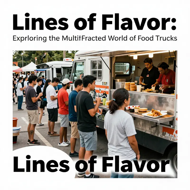
Every food truck is built around a line, but not just the line you stand in. The line that frames the customer experience is a web of moments where people decide, wait, and receive their meals. In this chapter, we explore how queues form in the real world of street dining, using a practical lens on queueing dynamics to reveal why some lines move smoothly while others feel endless. The street corner, the festival lot, the parking lot outside a concert, or a bustling market all become a microcosm of service design where space, time, and human behavior collide. Here, the line is not merely a path to the window; it is the heartbeat of the operation. Understanding it means looking at how many customers arrive, how quickly the truck can prepare and hand off food, and how staff coordinate a sequence that feels fair and predictable to those waiting. In food truck operations, these elements are in constant flux. Arrival rates swing with the hour, the weather, and the event calendar. Service capacity depends on the truck’s size, layout, and crew; a compact van can churn through a steady stream of orders, while a bigger, more capable unit can handle a more complex menu and a larger queue. The relationship between demand and throughput is not a simple straight line. It bends under the weight of physical constraints, the psychology of waiting, and the hidden costs of multitasking. When arrivals surge, bottlenecks emerge not only in the cooking line but in the cash register, the pickup window, and the flow of movement around the service area. In many trucks, the staff juggle multiple roles—taking orders, processing payments, assembling dishes, and handing off the food. The absence of automatic gratuities or service charges means each step falls on human hands and judgment. This broader workload can lengthen service times just as surely as a narrow kitchen can bottleneck a kitchen crew during peak times. The practical upshot is that line length becomes a visible signal of capacity. If the queue grows, it is often a sign that the system is operating near its limit. Operators notice the crowd density, customers become more patient or restless, and the crew instinctively adjust pacing, sometimes slowing to ensure accuracy, sometimes speeding up to clear the backlog. The dynamics are complex because the same line that represents waiting also represents trust. Patrons gauge fairness not only by how fast they are served but by how predictable the process feels. Quick, visible signs of progress—order numbers advancing, clear markers for when to join or move forward, and a straightforward pickup area—reduce perceived wait times even when actual wait times are constant. This is where branding and signage become more than decoration; they become operational cues. A well-designed visual language helps people understand where to stand, where to order, and where to pick up. It communicates expectations and reduces missteps that would otherwise add seconds to each transaction. In fact, the branding work that shapes a truck’s identity also shapes the queue’s rhythm. Clear, consistent visuals guide customers through the flow, so the line moves with fewer hesitations and fewer must-do clarifications. For operators who want to see the link between design and function, the concept of a single-line, multi-server model can be a simple yet powerful framework. Instead of a single server handling everything, the line is arranged so that different stages—taking orders, cooking, assembling, and pickup—happen in a logical progression along a line. The customer arrives, places an order at a designated window, and then steps into a second zone where the food is prepared. Finally, they move to a pickup point where the finished plates are handed off. This separation helps reduce cross-traffic and confusion, which are common culprits in longer wait times. It is not only about speed; it is about clarity. Signage and staff communication reinforce this clarity. A well-marked ordering area, a visible progress indicator, and a clearly marked pickup window together create a sense of transparency. People feel that they are in control of their own pace, even as the line grows. The physical footprint of the truck matters as well. A van-based setup might manage twenty to thirty customers per hour under steady conditions, while larger units with more kitchen space and a leaner operational rhythm can reach fifty to one hundred fifty guests per hour, particularly when the menu is streamlined or when efficient, modular assembly processes are in play. Menu design itself interacts with queue length. A concise, well-curated line of offerings reduces decision time at the point of order, which in turn accelerates total throughput. Yet this simplification must be balanced with the brand promise and customer expectations. The psychology of queuing teaches us that people are less patient with ambiguity and more tolerant when they feel the system is fair and predictable. Operators can cultivate this perception by standardizing flows, showing estimated wait times, and communicating clearly about the next step. Even small improvements, like a simple tap of a digital payment option or a pre-order method, can shave minutes from peak-period flux. The broader lesson is that line management is not a separate discipline from branding. It lives at the intersection of layout, staffing, and customer communication. The way a truck uses its space, the sequence in which tasks occur, and the prompts given to customers all contribute to a smoother experience. For those exploring this crossroad of design and operations, a practical reminder sits near every busy curb: the line is a living thing, adjusting to the weather of demand, the skill of the crew, and the clarity of the cues you provide. As a nod to how design and process intertwine, consider the broader guidance on brand visuals and identity—an area that directly influences how customers interpret the line. You can explore branding on wheels: the ultimate guide to food truck graphics and identity to see how signage, color, and typography convey flow and promise to passersby and waiting patrons alike. The point here is not decoration but direction. The better the branding communicates where to queue, where to order, and where to collect, the more efficient the line becomes. For a theoretical frame that anchors these observations in established research, see ScienceDirect Topics on queueing theory. It offers a structured look at how load affects service times and the consequences for service system design, which helps translate street-level intuition into measurable performance metrics. In sum, the line at a food truck is a dynamic, multi-faceted theater where arrival rates, kitchen layout, staff coordination, and clear signaling converge. When operators design for clarity, balance capacity with demand, and align branding with process, queues become not a source of frustration but a predictable, learnable part of the experience. The next time you walk up to a food truck, notice how the space guides your own pace and how the team behind the counter uses the line to deliver both speed and satisfaction. For readers seeking a broader conceptual grounding, the external resource provides a rigorous view of the underpinnings of these dynamics: https://www.sciencedirect.com/topics/engineering/queueing-theory.
The Menu Line-Up: Types of Food Offered on a Food Truck
The menu line-up on a food truck is a living thread that stitches together identity, craft, and audience into a single moving story. It is more than a roster of dishes; it is a signal to customers about what the truck values, and a roadmap for the kitchen team about how to deliver it efficiently under the pressure of a busy window. Each category within that line signals a different rhythm of operation, different equipment needs, and different expectations from diners. When you listen closely, the lineup speaks not just of flavor, but of logistics, branding, and the fleeting chemistry that makes a street meal feel like a shared event.
Health-focused cuisine marks a deliberate choice to foreground freshness and balance. In this line, the emphasis is on bowls and plates built around grains, leafy greens, and plant-based proteins. Dressings are bright and light, textures vary from crisp to silky, and flavors lean toward clarity rather than heaviness. The kitchen workflow for this line prioritizes rapid, precise prep, reliable cold storage, and careful sourcing that supports transparency. It also shapes packaging decisions—sustainable materials and clear ingredient labeling that reassure customers who seek wholesome options. The pace of service is brisk, but the rhythm remains controlled, so every bite can feel both nutritious and satisfying without sacrificing throughput.
Dessert specialties bring theater to the curb, turning the street into a stage for texture, temperature, and surprise. The line here leans into indulgence, offering deep contrasts between a crisp exterior and a soft center, or between a warm element and a cold topping. Preparation is compact but highly choreographed: fry or heat with attention to oil management and consistent heat, then finish with toppings, sauces, or dustings that pop in color and scent. Menu items must be repeatable day after day, with predictable yield so the line can move quickly even as crowds grow. This is where a truck’s personality shines—playful, bold, and photogenic—capturing attention in a market where a single glance can decide whether a customer queues up or walks by.
Breakfast and brunch lines carve out a different slice of the day. They prize heartiness, portability, and speed, delivering meals people can grab on their way to work or between shifts. A breakfast burrito line, for example, relies on a wide grill, steady access to eggs, beans, cheese, salsa, and tortillas, and a workstation that allows guests to watch the action from the window. The open-concept layout fosters engagement, turning the cooking moment into a shared ritual. Integrated refrigeration keeps ingredients fresh while a well-planned inventory system cuts waste. The aroma of sizzling components, the sight of steam rising from a folded tortilla, and the satisfaction of a neatly wrapped package create a morning energy that is hard to imitate elsewhere. The menu for this line tends toward comfort foods with reliable execution and a price point that accommodates commuters and seasonal crowds alike.
Specialty cuisines provide a focused identity that can carve out a loyal following in a crowded scene. Whether leaning into barbecue, pan-Asian influences, or Italian street food, a clear line of dishes helps a truck differentiate itself. A tightly defined cuisine allows the kitchen to optimize equipment—smoky pits, wok ranges, or compact steamers—while still staying within the confines of a mobile kitchen. The challenge lies in balancing authenticity with practicality: sauces must travel well, proteins need precise timing, and toppings must remain crisp after a short voyage. This focus reduces decision fatigue for customers and speeds service, producing a cadence that fits markets, universities, and cultural festivals alike.
Second-hand trucks and customization rounds out the spectrum, offering an accessible pathway for aspiring operators. A reused chassis can be retrofitted to suit any cuisine—from simple street food to a full kitchen on wheels—providing a flexible platform to test concepts before committing to a larger investment. Retrofit decisions shape the lineup as well: adaptable prep zones, modular cooking stations, and energy-efficient refrigeration extend the truck’s life and stabilize operating costs. The resulting menu line may evolve with feedback from events, supplier cycles, or the operator’s evolving culinary curiosity. In this sense, the line is not merely about what is served; it is about the confidence and consistency with which a truck can deliver across days, venues, and changing weather.
Across these varied line-ups, a common logic emerges: the menu is crafted for throughput as much as for pleasure. A strong lineup anchors the day with a few dependable items that can be prepared in bulk, paired with a handful of rotating specials to spark curiosity. The relationship between menu, equipment, and space matters just as much as the recipes themselves. The size and shape of the grill, the capacity of the fryers, and the reach of the cold storage all influence what can be offered and how quickly it can be delivered. A cohesive menu line-up acts in concert with branding, turning flavor choices into a visible promise that customers can read at a glance. For operators, the challenge is not merely to fill the board with items but to choreograph them so the kitchen can sustain quality from first order to last plate. For patrons, the appeal lies in clarity—an easy read of what the truck does best, with enough variety to invite repeat visits without overwhelming the senses.
A well-considered menu line-up also accommodates the realities of street eating: seasonality, supplier availability, and the inevitable fluctuations in foot traffic. Seasons bring fresh produce and new inspirations, which can be integrated as limited-time items that refresh the line without sacrificing core competencies. This seasonal adaptability is not a gimmick but a strategic approach to keeping the lineup vibrant while maintaining a steady core. Pricing strategy becomes part of the lineup, too. Bundled options and value-added combos can increase throughput by simplifying decision-making and speeding up the line, while ensuring margins stay healthy enough to cover peak-hour costs. The line also carries responsibility: clear allergen information and careful labeling support a safe, inclusive experience for a broad range of diners. The staff must be trained to communicate the ingredients, cross-contact risks, and alternative options with confidence, so customers feel seen and cared for from the moment they approach the window.
The human element remains central. A well-run menu line-up depends on recipe standardization, precise portioning, and reliable sourcing. Standardized recipes minimize variability, enabling the crew to reproduce results across markets and weather conditions. Clear station assignments and visual cues—color-coded bins, labeled pans, and consistent plating accents—help stations stay synchronized in the heat of service. This discipline underpins trust: regulars know what to expect, first-timers feel surprised by a new favorite, and operators gain the confidence to expand into new venues with a tested playbook. All of this happens within the context of branding, where the menu is the mouthpiece of a larger identity. The visuals you see on the board, the fonts you read at the window, and the iconography beside each item should echo the same story you tell with your flavors. A practical example of this alignment is found in the branding-on-wheels guide to graphics and identity, which frames how color, typography, and iconography can harmonize with the menu choice and the overall street presence: branding-on-wheels-the-ultimate-guide-to-food-truck-graphics-and-identity.
The menu line-up is, finally, a dialogue with the audience. Health-focused lines speak to a growing urban interest in wellness and sustainability. Dessert-forward lines speak to celebration and indulgence, offering a counterpoint that attracts late-night crowds and festival-goers. Breakfast lines connect to commuters and students who require quick, satisfying nourishment. Specialty cuisines promise adventure and authenticity, drawing in visitors looking for a taste of a place or tradition in a portable form. Second-hand and customized platforms remind us that entrepreneurship, not perfection, often drives innovation in mobile dining. Each line, in its own way, invites a specific kind of interaction: the eye, the palate, the clock, and the wallet all contribute to the moment when a customer decides to queue, sample, and linger.
For operators seeking a broader framework, the external landscape offers a wealth of practical guidance. A comprehensive overview of kitchen flow, equipment considerations, and operational constraints can deepen understanding of how a menu line-up must sit inside a mobile workspace. External resources that examine the broader terrain of UK food truck practice, for example, provide technical context that helps translate taste into throughput and resilience across markets. See the external resource here for a broader look at how trucks organize their kitchens and line-ups: https://www.foodtrucks.org.uk/uk-food-truck-guide-2026
In the end, the menu line-up is a compact manifesto about how a truck earns a place on the street: it communicates purpose, it orchestrates a daily sequence of actions, and it invites a diverse audience to become part of the story, one plate at a time. The line between what is offered and how it is delivered becomes a shared experience, a continuous conversation between cook, cashier, and customer that unfolds with every flip of a tortilla, every ladle of sauce, and every plate slid across the window. The more thoughtful the lineup, the more fluid the line, and the more likely the truck will be remembered long after the last bite.
Mobile Lines, Enduring Identity: Crafting the Product Line that Defines a Food Truck
The term line in the world of food trucks stretches beyond the simple queue or a single item on a menu. It is the living spine of a mobile business: what the truck offers, how it presents itself, and how it moves people from curiosity to purchase. A well-made product line is not just a list of foods; it is a carefully tuned system that aligns the truck’s design, its equipment, and its intended audience into a single, cohesive operation. When we talk about lines, we can think in four intertwined ways: the design and branding line, the customer line, the menu line, and the broader product line that a vendor may offer across a fleet of vehicles. Each of these strands reinforces the others, creating a distinctive voice that customers recognize in a split second as they navigate a crowded street or festival grounds. In this sense, the “line” becomes a strategic compass, guiding where the truck sits in the market, what it serves, and how efficiently it serves it.
The first strand—the design and branding line—shapes first impressions long before a customer places an order. A truck’s exterior, its decals, and the graphic language used on menus and signage work together to communicate speed, quality, and personality. In many cases, designers favor line art and simplified graphics because they translate well at a distance and scale. A single, fluid line can evoke motion and warmth, hint at the cuisine, and remain legible on social media icons and storefronts. The visual line is not an afterthought; it governs how people perceive the truck’s capabilities and its story. For operators, this means a deliberate choice about whether to lean into a modern, minimalist logo that suggests efficiency, or a vintage, hand-drawn style that promises comfort and nostalgia. Branding on wheels, the ultimate guide to food-truck graphics and identity, explores how line art and identity work in tandem to establish recognition and trust. See how a cohesive graphic system can turn a passing glance into a line of repeat customers. branding-on-wheels-the-ultimate-guide-to-food-truck-graphics-and-identity
The second strand is the customer line—the literal queue that forms when a truck hits a popular spot or a busy event. A high-volume truck owes much of its success to the flow and management of this line. Operationally, it means a kitchen designed for speed and consistency, where a streamlined workflow minimizes the time between order and delivery. It also means a menu line that is legible and fast to assemble. A concise selection of core items can reduce wait times and keep quality uniform, while still offering variety within a defined theme. Some trucks are designed for rapid service with a simple core menu—hot dogs, sandwiches, fries, and nachos—where the kitchen layout, cooking equipment, and prep stations are arranged to maximize throughput. The deliberate choice of items matters as much as the space and the people executing the service. In crowded settings, the line of customers becomes a live feedback loop; the longer the line, the more a truck must adapt its operations or adjust its menu to maintain pace without sacrificing taste or presentation.
The third strand centers on the menu line—the lineup of dishes and drinks that defines the truck’s culinary identity. A menu line can be tightly focused, offering a few signature items assembled with speed and precision, or it can be broader, blending influences from different cuisines to create a fusion profile. The variability in the product line is often tied to the truck’s design and equipment. A vehicle engineered for quick assembly and high turnover naturally supports items that are straightforward to plate and finish on the fly. Conversely, a coffee truck carries a different line of products, where espresso machines, grinders, and milk refrigeration define the operation. The menu may extend beyond beverages to pastries and light snacks, aligning with café culture while preserving the mobility and efficiency required on wheels. The interplay between menu breadth and equipment depth shapes choices about sourcing, training, and inventory management. A broad, ambitious line might attract a wider audience, but it demands more careful zoning of space and more disciplined procurement. A focused, premium line can create a strong identity and simplify logistics, even if it appeals to a narrower crowd.
The fourth strand is the fleet and the model line—the broader product line that a manufacturer or operator conceptually offers beyond a single truck. This is where variability truly shines. In one segment, you meet trucks optimized for speed and high-volume service, designed for urban corners and transit hubs. They emphasize fast assembly, simple menus, and efficient dish throughput. In another segment, you encounter specialty concepts—vehicles built around a particular coffee culture or a specific street-food tradition. These trucks invest in features that enhance the guest experience, such as specialized beverage equipment, premium refrigeration, or integrated ordering systems. And then there are vintage or retro-styled designs, which blend nostalgia with modern automation to reduce friction in the ordering process. The common thread across these different product lines is a clear alignment between what the truck can physically do and what the market expects from it. The line is not merely about the flavor of food; it is about the way the business models, the vehicle configurations, and the customer interactions all harmonize to deliver a dependable experience.
As the research on food truck configurations reveals, the variability in product lines is not arbitrary. It reflects deliberate choices about design, equipment, and purpose. A mobile kitchen that prioritizes speed and turnover will typically employ streamlined layouts, compact cooking modules, and a menu that can be assembled quickly from a small set of core ingredients. A coffee-focused truck, meanwhile, invests in barista-grade machinery, careful water filtration, and temperature control, alongside a complementary pastry lineup that elevates the beverage experience. A vintage-inspired truck may use a hybrid approach, pairing a nostalgic exterior with touch-screen ordering or automated dispensers to modernize the customer journey while retaining the charm of the era it emulates. A budget-oriented truck targets locations with predictable foot traffic and predictable demand, offering familiar items at approachable prices and designing its footprint around cost efficiency and scalability. Each approach demonstrates how the product line, in concert with the truck’s design and location strategy, creates a durable pathway to profitability.
This interconnectedness—between design, queue dynamics, menu architecture, and fleet strategy—highlights a central truth: a food truck’s line is a living system. It evolves with the market, adapts to regulatory constraints, and shifts as consumer tastes ebb and flow. Operators who consciously shape their line at the conceptual level often find themselves better prepared to respond when the crowds arrive or the weather turns. The best lines are not static; they respond to the street’s pulse. They balance consistency with innovation, ensuring that the brand feels reliable while offering occasional surprises that keep loyal customers engaged. In practice, this means choosing a design that communicates your core strengths, selecting equipment that supports your preferred menu, and cultivating a service narrative that makes every guest feel understood and welcomed.
The product line also has implications for storytelling and social presence. A cohesive line makes it easier to craft a compelling narrative across platforms, from storefront signage to social media posts. When the branding is coherent—when the logo, color palette, typography, and iconography speak the same language—the truck becomes instantly recognizable in a crowded market. In turn, this recognition lowers the cognitive load for potential customers, who can anticipate what they will experience and where the truck fits within their daily rhythms. The result is a stronger emotional connection and a more predictable path to repeat visits. It is not merely about serving good food; it is about building a trusted, familiar experience that customers seek out when deciding where to eat on the move.
The variability in product lines is also a practical invitation for prospective operators. If you are weighing different routes for a new venture, study the alignment between your intended audience, the physical constraints of your vehicle, and the types of equipment required to deliver your menu with consistency. Consider whether your aim is to maximize throughput at peak hours or to craft a memorable, café-like experience on wheels. Both paths can succeed, provided the line is thoughtfully integrated into every decision—from the color of the branding and the flow of the kitchen to the pacing of service and the tone of the guest interaction. In this way, the line becomes a compass rather than a constraint, guiding improvements and expansions as the business grows.
For readers seeking a broader view of how these choices translate into practical, real-world setups, a closer look at industry perspectives on materials, construction, and use stands out. See the external resource on material grades and uses for food trucks to ground these concepts in tangible specifications. This broader context complements the chapter’s focus on how product lines vary and why those variations matter for day-to-day operations. In the end, a well-constructed product line does more than offer diverse foods; it creates a reliable, scalable platform for delivering a distinct and satisfying street-food experience that travels well across neighborhoods and seasons. The line you choose today shapes the truck you run tomorrow, shaping what your customers expect and what they remember after they walk away from the curb.
External resource for further context: Best Food Trucks for Sale: Material Grades and Uses
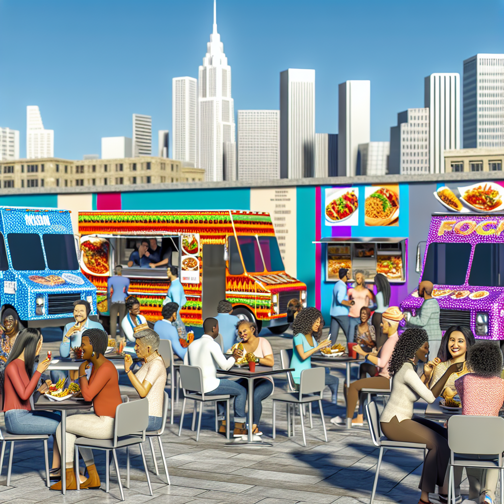
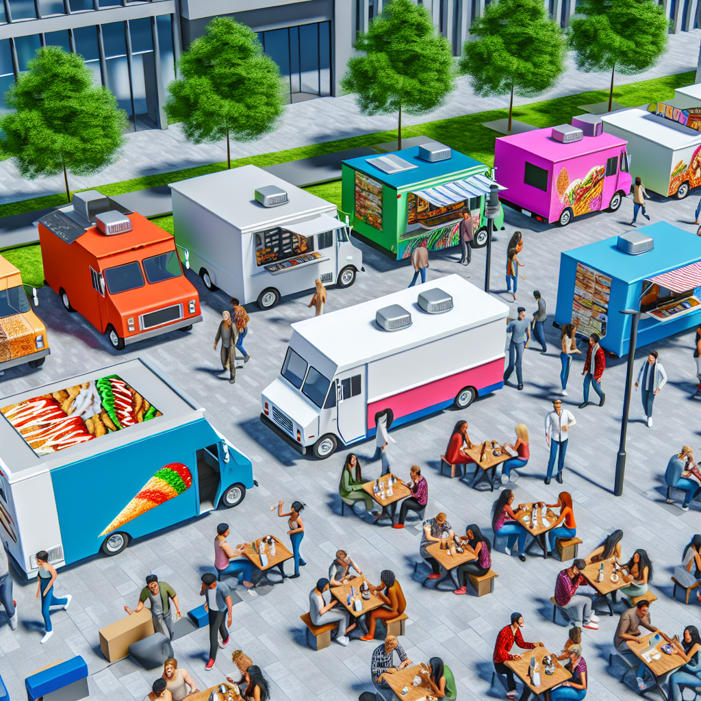
Cultural Impact: The Line Experience in Food Truck Events
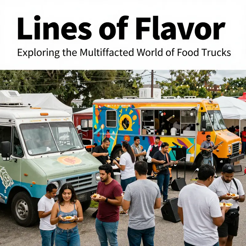
The line at a food truck is more than a queue; it is a living corridor where strangers become neighbors for a few minutes, and a simple act of waiting morphs into a shared social ritual. At festivals, markets, and street corners, the line forms a braided thread of anticipation that threads together people from different walks of life. In this space, conversations begin with the practical—what are you going to order, how spicy is that dish, where did you travel from—but soon drift into broader stories about hometowns, family recipes, and the small rituals that color daily life. The line, therefore, is not just a bottleneck to be endured; it is a dynamic stage where communal energy gathers, rehearses, and amplifies the pleasure of food. The result is an atmosphere that transcends the act of eating. Patrons arrive with different moods, meet others along the way, and depart with a shared memory that belongs to the collective experience of the event. This transformation of waiting into a moment of social exchange has become a defining feature of modern food truck culture, a phenomenon that enriches the overall sense of belonging even for a brief, everyday ritual.
The physicality of the line—the way people stand, move, and nod to one another—helps shape this culture in subtle but powerful ways. The line can stretch along a sidewalk like a living sculpture, its shape changing with the hour and the crowd. The aroma from the grill drifts through the group, becoming a shared cue that tethers conversations to the imminent reward. In that shared tempo, jokes, recommendations, and memories circulate as naturally as the loaves and noodles sizzling behind the window. The line becomes a micro-community where introductions happen without effort and where laughter travels as easily as the steam from the pan. Even the pauses—someone checking their phone, a child tugging at a parent’s sleeve, a friend catching up with a friend—take on a social rhythm, a cadence that contributes to the event’s texture. The line, then, is not merely about who orders first; it is a space where social dynamics unfold, where people negotiate belonging, and where culture seeps into the everyday action of waiting.
In this social chamber, language and identity mingle with the sensory pull of food. People swap tips about the best bites, suggest personal twists on a dish, or describe a family recipe that might be familiar from home kitchens far away. The exchange is not loud or programmatic; it is intimate and often fleeting, but it builds a network of micro-relationships that can feel surprisingly enduring. A grandmother who shares a tip about cooling a spicy noodle bowl, a student who trades a line about the best late-night snack, a traveler who recommends a local favorite—these moments accumulate into a broader cultural pattern. The line becomes a safety net for inclusion: it invites newcomers to listen, share, and participate rather than stand apart. In this sense, the waiting room becomes a forum for community building, where curiosity, openness, and appetite work in tandem to increase social cohesion.
The line also operates as a site of performance, where the logistics of the day are visible to the crowd. Observing the flow of people, the pace at which orders are taken, and the choreography of the cooks behind the counter offers a kind of live theater. This theater is not staged for spectacle; it emerges from the needs of efficient service, the improvisations that occur when the crowd grows larger than anticipated, and the small acts of hospitality that vendors practice to smooth the path to the window. The line, therefore, becomes a shared theater in which vendors and customers negotiate expectations, reinforce trust, and shape future visits. When a line moves smoothly, the mood shifts from impatience to anticipation; when it disrupts, the crowd responds with humor, resilience, and collective problem-solving. The way a line responds to pressure speaks volumes about a community’s capacity to adapt and to care for one another in public spaces.
Branding and identity subtly shape this line experience as well. The visual language of a truck—the color palette, the typography on the menu board, the style of the logo—acts like an unspoken invitation that informs how people perceive and join the queue. Clean, confident graphics can signal clarity and speed, encouraging someone who is new to the scene to trust the operation and step into line with ease. Conversely, a warm, playful aesthetic can normalize longer waits as part of a friendly ritual, inviting people to linger, chat, and linger again. This feedback loop between branding and the line is not accidental; it is a conscious design choice that many operators consider when planning events, staffing, and signage. In other words, what you see on the truck’s exterior can influence how you feel in the line and how you remember the moment when you finally reach the window. For readers curious about how visual identity on wheels translates into customer experience, this is a fertile area of study and practice. branding-on-wheels-the-ultimate-guide-to-food-truck-graphics-and-identity
The social function of the line is inseparable from its economic and logistical realities. A line can reveal demand patterns in real time: which dishes draw the biggest crowds, whether a particular combination or topping sparks a surge of interest, and how changes in weather, location, or timing alter the flow. This information, when observed collectively, becomes a source of communal knowledge that strengthens the event’s sense of shared purpose. The line thus contributes to a feedback loop where the community’s expectations inform the vendor’s decisions, and those decisions, in turn, shape future lines. When participants feel heard—even through the simple act of a cook nodding at a suggestion or a staff member explaining a brief delay—they develop a sense of stake in the event. That sense of stake reinforces the social fabric and converts a temporary encounter into a lasting impression. The line, in this light, is not a nuisance to be endured but a shared experience to be valued.
This cultural dimension of the line is amplified at scale by the way events curate space, sound, and flow. Music, ambient chatter, and the clatter of utensils all become part of a melodic backdrop that frames the waiting experience. The line around a highly anticipated truck can transform into a spontaneous stage for micro-communities—friends reuniting, coworkers sharing stories across a city block, neighbors discovering a new culinary favorite together. In these moments, the line’s social energy spills over into the surrounding streets, turning a routine pit stop into a neighborhood gathering. The cultural impact, then, is not limited to the moment of ordering. It extends into the afterglow—the conversations sparked by the menu, the friendships formed at the curb, and the sense that food can be a bridge across difference.
For those studying or shaping contemporary food culture, the line is a surprisingly rich lens. It highlights how ordinary acts—standing in line, waiting for food, sharing a table or a bench—become opportunities for connection, learning, and mutual appreciation. It reminds us that the most meaningful aspects of food experiences often lie not in the moment of consumption alone but in the social choreography that leads to it. As readers explore this topic further, they may find that the line’s social texture offers practical lessons for organizers and operators: how to design lines that nurture inclusion, how to cultivate conversations that welcome strangers, and how to align branding with lived experience so that every wait feels purposeful rather than peripheral.
External perspective can be found in broader coverage of waiting as a social ritual. For more on how this unique social phenomenon shapes modern food truck culture, see: https://www.bbc.com/news/uk-68751234.
Final thoughts
Food trucks serve as a canvas for culinary creativity, showcasing a kaleidoscope of food options, artistic expressions, and community engagement. The various meanings of ‘line’—from artistic logos to customer queues and versatile menus—highlight their significance in the street food culture. Whether you’re an event planner seeking unique food experiences, a consumer with a love for flavorful fare, or someone passionate about the food truck phenomenon, understanding these elements enriches your appreciation for this mobile dining experience. Food trucks are not just places for quick bites; they are hubs of cultural exchange and creativity, turning every queue into an opportunity for delicious adventure.